Mozilla Revives Nostalgia: Introducing a New Logo with a Dinosaur Twist
A new Mozilla logo appears to be on the way, marking the company’s first major update to its word-mark since 2017.
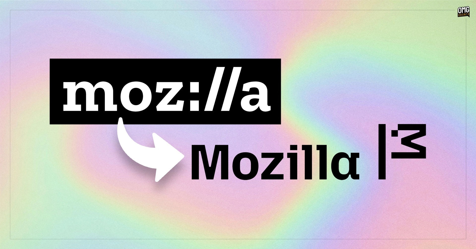
The existing logo, which incorporates the internet protocol “://”, was chosen based on community feedback and has become synonymous with the non-profit company.
But German blogger Sören Hentzschel, a keen observer of Mozilla, recently noticed a different Mozilla word-mark accompanying the (unchanged) Firefox logo on Mozilla’s ‘Nothing Personal’ webpage.
Some recent investigations revealed a variety of new code updates preparing and mentioning a revamped word-mark and icon for implementation in Mozilla’s website navigations, landing pages, and more.
The reimagined Mozilla word-mark has moved away from the Zilla Slab typeface that was introduced with the “moz://a” logo in 2017.
Fortunately, the revamped design avoids the common Sans Serif blandness trend. The new typeface, distinct for its blocky and angular nature, includes unique features like a squared spur and terminal (possibly termed as such) on the lowercase ‘a,’ giving it a tech-oriented, monospaced feel.
Additionally, it’s noteworthy that the updated word-mark does not incorporate a background.
Design guidelines for the existing ‘moz://a’ word-mark specify that it must always be used within a rectangle, suggesting it functions as a label. The latest replacement does not follow this directive as the SVG assets available on Mozilla’s GitHub are transparent and free from any bounding box.
What excites me most about the new logo, as a self-professed nerd, is the ASCII symbol introduced at the end.
It resembles a flag mounted on a pole, symbolizing Mozilla putting down its marker, declaring its presence and values.
But it’s more likely a nod to the original Mozilla mascot (inherited from its Netscape beginnings), which was a red dinosaur (an interesting logo of itself as it was designed by Shepard Fairey who created other seminal design works, and the skate brand OBEY).
Cool, huh!
Between the inclusion on a live webpage, code commits readying new logo for Mozilla websites, and the fact people can buy official Mozilla merchandise emblazoned with the new design, it seems a formal rebrand announcement is fairly imminent…
There’s often limited excitement over the visual updates like logo redesigns or aesthetic modifications in the open-source community, and considerations about better allocation of funds persist (which is understandable). Some argue that these funds should be directed towards fundamental software enhancements.
While this viewpoint holds merit, it potentially underestimates the significance of branding.
A strong brand identity is crucial for any entity, regardless of its size or nature. It communicates the essence of what the organization is and believes in, signaling professionalism. This is critical in attracting and reassuring users, contributors, and investors alike.
Moreover, visually refreshing changes can be delightful to observe.