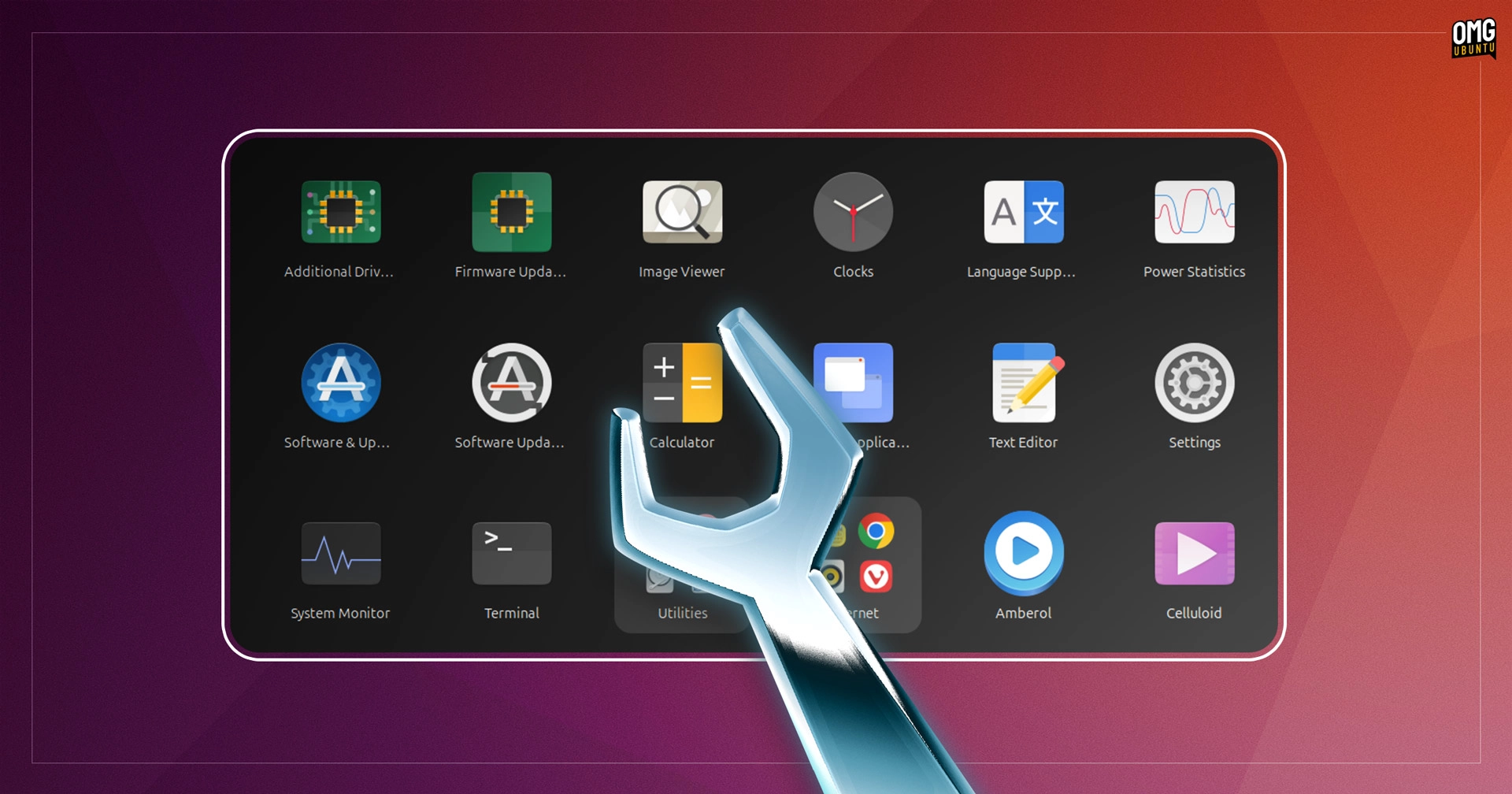
It appears that Ubuntu’s default icon theme, Yaru, has a subtle yet significant design flaw: some of its icons are oversized. The Yaru icon theme employs four different shapes for its app, folder, and file icons: square, circle, vertical rectangle, and horizontal rectangle. The square icons, which feature rounded corners, are notably larger than desired when compared to rectangular shapes, leading to a visual inconsistency.
Users with keen eyes and an eye for detail noticed that the square-shaped app icons lack what designers refer to as "optical compensation" when paired with those rectangular icons. A new, correctly proportioned square size has been determined to address this, steering clear of anti-aliasing issues, and some mock-ups of the new icons have been created to demonstrate the difference.
The design team member known as ubuntujaggers is currently working on the task of resizing the square icons, which involves more than simple batch resizing. Each icon must be carefully adjusted to fit within its new, smaller square. Once this work is completed, a decision will be made about incorporating these new icons into the upcoming release known as Plucky.
While this may seem like a minor detail, ensuring that Ubuntu’s visual elements are well-crafted is important for the overall aesthetic and user experience. Small issues like this can make a difference in how the operating system is perceived.
For further conversation on the design changes, visit the Yaru GitHub page.
