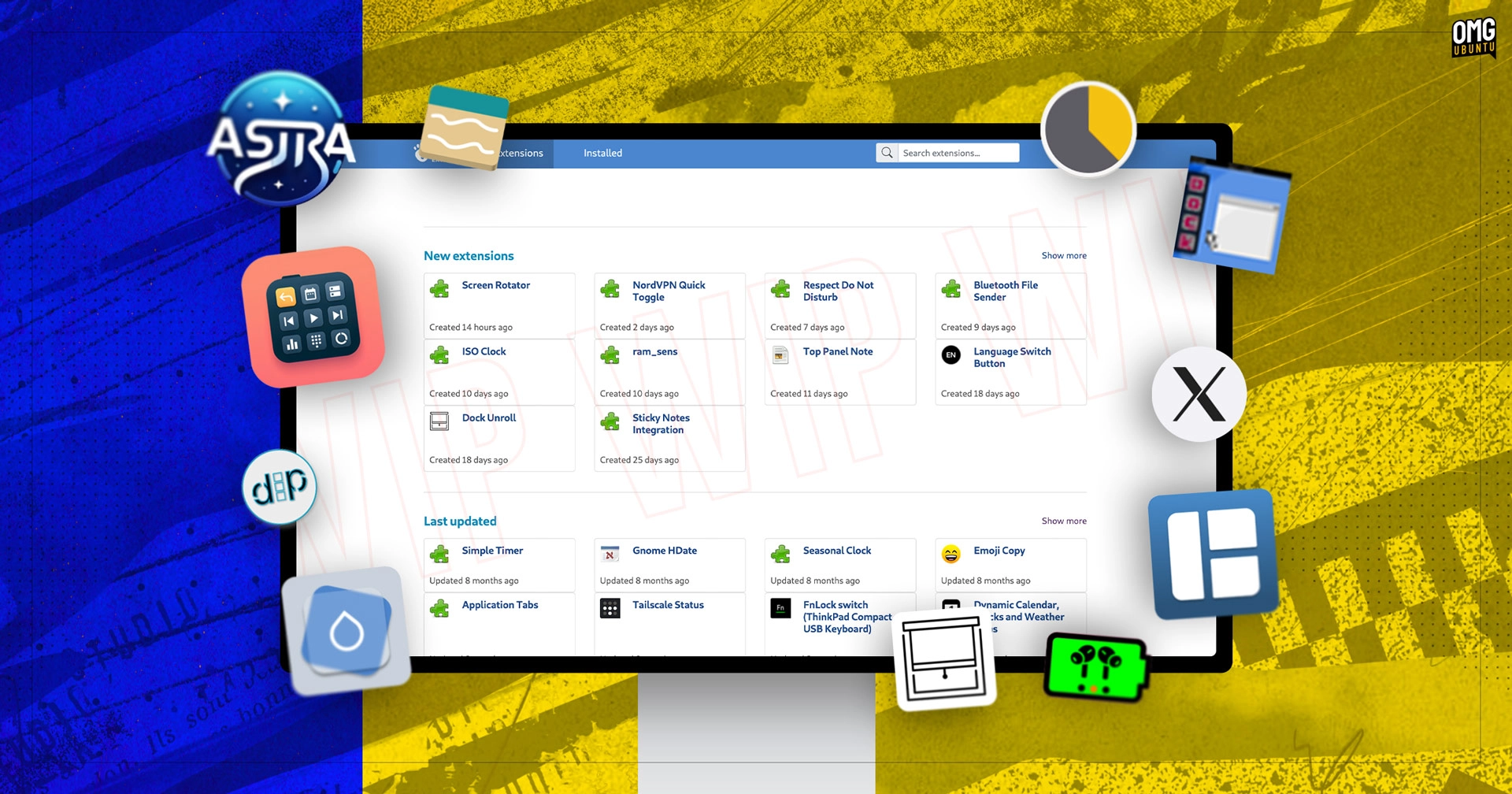
A major overhaul of the GNOME extensions website is in the works.
As the recent revamp of Flathub proved, engaging store fronts for software and extensions are not the preserve of big-time tech companies like Google, Apple, and Microsoft. Good design is good design, whoever does it.
GNOME Extensions offer a quick and easy way to add new features, behaviours, and visual changes to GNOME Shell. The extensions.gnome.org (EGO) website is the go-to place to find and install them.
But a revamp is long overdue.
GNOME Extensions Website Revamp
If you visit the GNOME Extensions website today, you’ll see the same list-based layout you’d have seen if you visited in 2012: a vertical list of available extensions, options to change the order/sorting, and a search box.
There’s nothing inherently wrong with the design as it is. It’s a pleasant, functional, no-frills directory of available extensions. It does everything it needs to.
But it doesn’t do everything it could do.
Which is why I’m stoked to discover that a substantial revamp to the GNOME Extensions website is on the way. The redesign boasts a brand-new layout to improve discovery, enhance search, and modernize the look of add-on pages.
I spotted the following changes in the new design (which is already available to try on a ‘live’ staging site hosted on GNOME infrastructure):
- New-look homepage shows more extensions at-a-glance
- Sections for New, Last Updated, and Popular extensions
- Search bar moved to the header
- Improved search sorting/filters, including ‘recommended’
- Updated extension listing pages with larger screenshots
Promising stuff, although this redesign is tentative. It is a work in progress. The basic skeleton you see in these screenshots is certain to get fleshed out, finessed, and perhaps furnished with a few extra features before it goes live.
A few more screenshots: –


Study the screenshots (or prod the staging version) and you’ll find styling quirks, broken features, and missing details. Listing pages, for instance, lack info currently shown on the production version, like number of downloads, GNOME version support, comments.
So, again: don’t take what you see here as a done-deal.
But, we all enjoy a sneak peek.
Should this redesign become live, I think it will do a lot to bolster the GNOME Extensions ecosystem. Making it easier for users to discover the best GNOME extensions is a win for users, extension developers, and GNOME as a desktop.
Showcasing the eclectic array of extensions could help fire users’ imaginations as to what they can do, leading to them creating their own or getting involved to help improve existing ones.
It’s all interconnected – today’s GNOME user could be tomorrow’s GNOME contributor.
Thanks [not sure if they want to be publicly credited]
- While you can install GNOME extensions using EGO I find Matt Jakeman’s magnificent Extensions Manager app an all-round easier experience. That said, I do visit EGO at least once a week. ↩︎


