A few months back, I shared that Mozilla is undergoing a brand revamp featuring the non-profit organization’s iconic red dinosaur mascot. Now, I have a bit more insight to share.
A reader named Nicolas recently pointed me towards the website of the global design agency Jones Knowles Ritchie, which Mozilla has engaged to refresh and enhance its brand identity.
Jones Knowles Ritchie boasts a significant reputation in the design world, having collaborated with globally recognized brands such as Burger King and Budweiser, and now, they are working with web browser developer Mozilla.
Their site includes a specific page showcasing their redesign efforts—although Mozilla has yet to officially announce or unveil the new logo. The page features captivating animations that, in my opinion, reveal the new design more effectively than the static images we’ve seen so far.
I find this one quite appealing:
Many of you who are reading this may remember the “window painting” glitch that was common in older operating systems. The animation presented above brings back that nostalgic effect, serving as an intriguing branding element while also subtly acknowledging Mozilla’s history, which dates back to 1998.
Mozilla has a clear mission: to reclaim the internet. They approached us in search of a brand identity that would revitalize tech design and support a global movement of activists, innovators, and creators, all dedicated to maintaining an open and accessible internet for everyone.
Jones Knowles Ritchie
I mentioned in my previous post that Mozilla’s new ‘symbol’ resembles an 8-bit flag more than a dinosaur, which is intentional as Mozilla advocates for a free and open internet.
Honestly, I wasn’t certain that the symbol was meant to evoke the iconic red Mozilla dinosaur!
However, an animated sequence in the JKR presentation brings the creature to life and confirms that it is indeed a reference and not merely a flag. This lively depiction captures some of the boldness and readiness to speak out that Mozilla is known for and admired.
Additional animated clips are available on the JKR portfolio page, showcasing their work for Mozilla. This page also features a few static graphics that illustrate how the new Mozilla wordmark, mascot symbol, color palette, and font harmonize in tone and style.
Not a fan?
Rebrands often face criticism. We tend to resist change just as much as we dislike stagnation.
Just like our clothing choices and hobbies evolve as we progress through life and shape our identity, companies must also ensure that their identity aligns with their current reality, rather than clinging to the past.
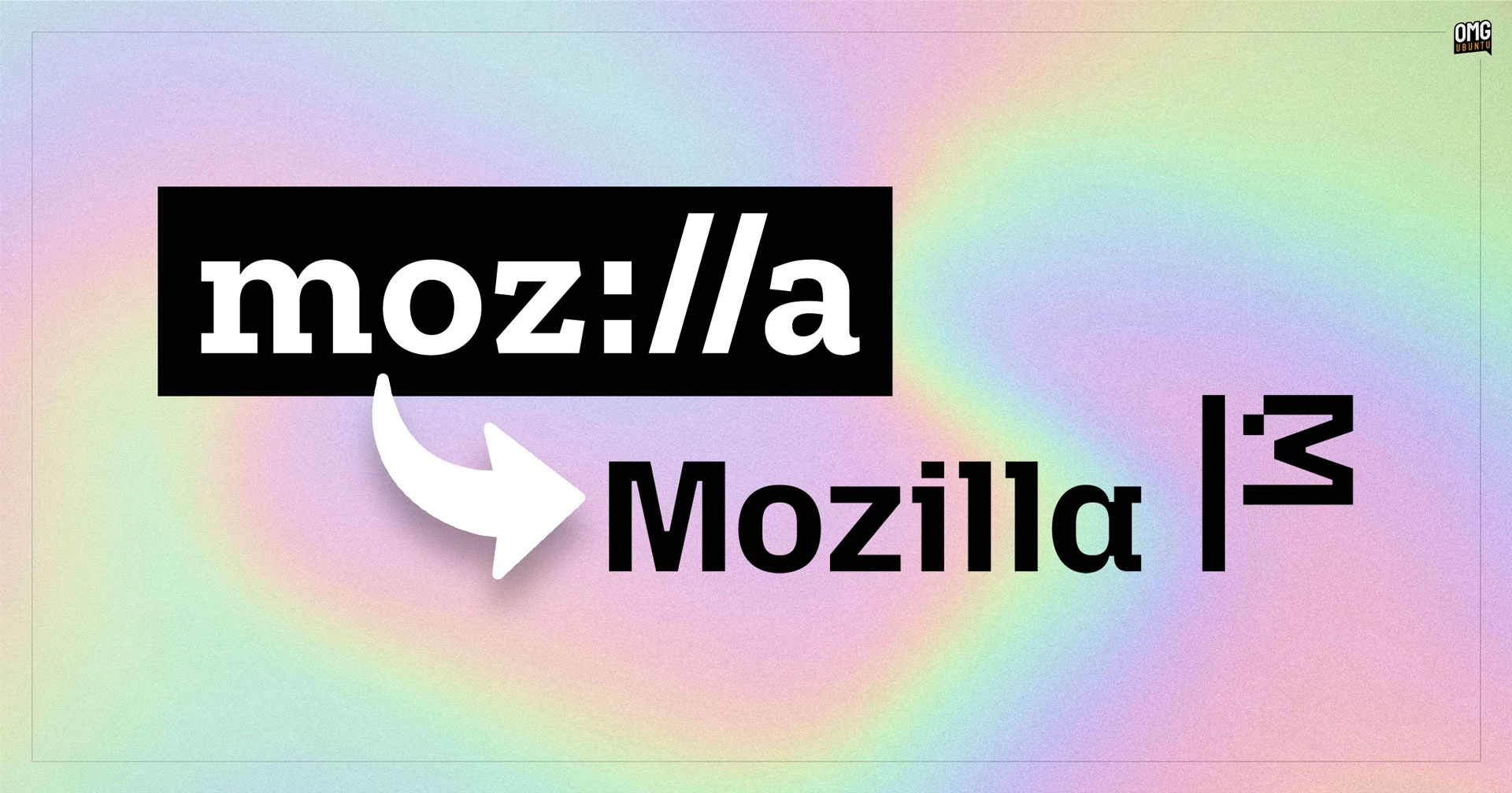
In the eight years since Mozilla last revamped its logo (“Moz://a”), the online environment has undergone significant transformation.
This rebranding effort has the potential to help Mozilla effectively convey its core principles to the broader World Wide Web community. This is essential for the non-profit to engage and inspire new contributors, secure funding, and sustain its operations.
And if you truly dislike the change, it’s likely you won’t encounter it frequently regardless.
Huge thanks to Nicolas!