The latest revision of the folder icons for Ubuntu 26.04 LTS has brought noticeable enhancements. Following a significant update to the Yaru theme, users were introduced to vibrant new directory icons along with other UI tweaks like consistent element shapes and the elimination of dock transparency by default.
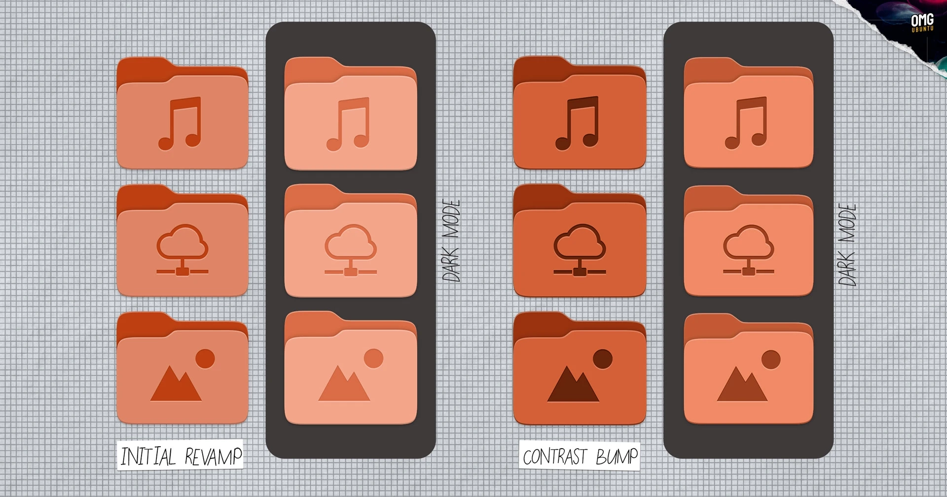
Originally, the Yaru theme transitioned from slate-colored folder icons to bold, colorful glyphs designed to align with the system’s accent colors. These updates included a unique engraved design for standard directories like Music, Pictures, and Downloads. However, initial feedback highlighted issues with the contrast of these folder colors, making them appear overly light in both light and dark modes, thereby detracting from the visibility of inset emblems.
In response to user feedback, a new improved folder set has been developed by Vincent Renzo Quilon and the Yaru design team, collaborating closely with Canonical’s Marco Trevisan. This revised design significantly boosts the color contrast of all folders, enhancing their visibility in both light and dark modes, and features darker inset icons particularly under dark mode conditions.
General consensus on the revisions has been largely favorable, echoing a preference for the return to a more colorful icon scheme compared to the previous slate style used since 2019. Early user reactions are guiding further refinements ahead of the stable release of Ubuntu 26.04 LTS in April, illustrating an effective and responsive development process.
For more details on the updated icons, you can visit more about Ubuntu 26.04 LTS and Yaru.